
• INSPIRATIONS •

Choosing colors is a complex process that goes beyond aesthetics: it's a means of evoking emotions and sensations. Colors are tools through which interior designers create sensory experiences and emotionally engaging environments, adapting each palette to the specific function of the space (relaxation, concentration, elegance, etc.).
Each color has a symbolic meaning and a psychological influence:
White
purity, luxury, spaciousness, cleanliness.
Black
refinement, mystery, deep.
Red
passion, energy, vitality.
Green
freshness, nature, serenity.
Blue
calm, concentration
Yellow
creativity, positivity, mental energy.
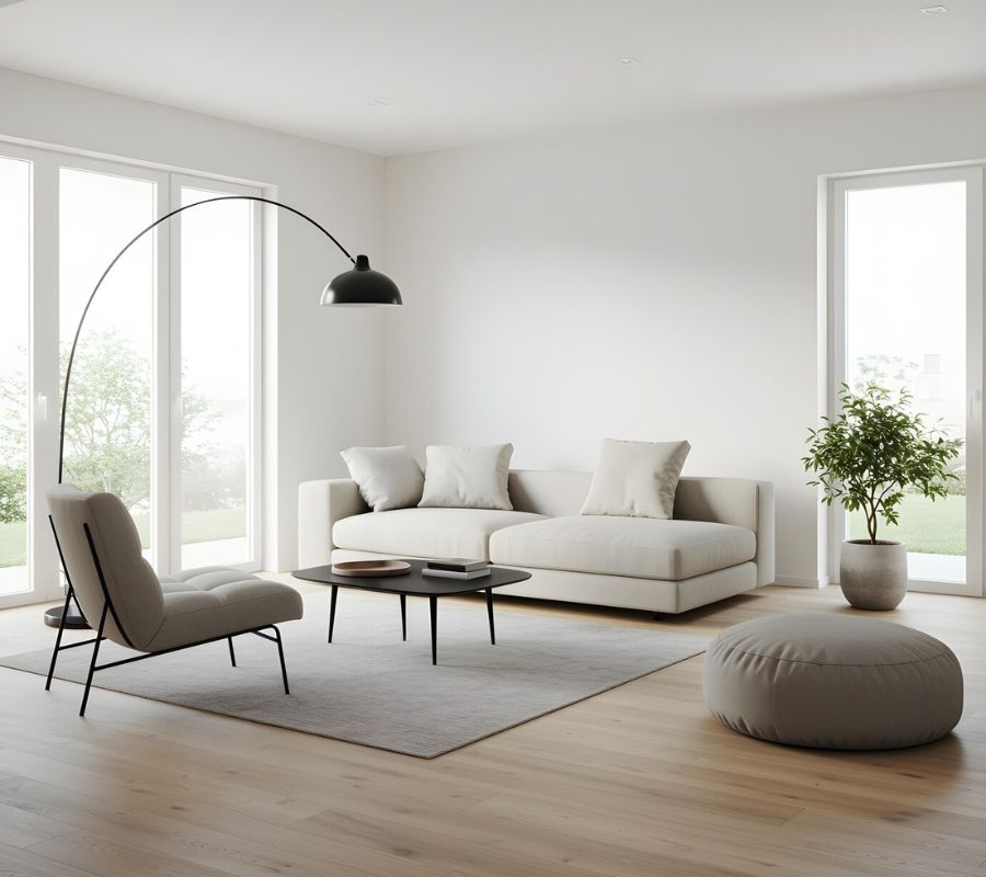
The balance between tone-on-tone colors and bold contrasts is essential for creating spaces that are interesting but not overwhelming. Textures and rich materials complement the visual and tactile effect, contributing to the space's elegance. Strategically pairing bold colors with neutrals helps prevent visual clashes and maintains aesthetic harmony. This approach ensures that vibrant colors serve as focal points, enriching the decor without overwhelming the senses.
Color directly impacts well-being and productivity: neutral tones for relaxation areas, to promote calm and tranquility.
Bright and stimulating colors for work environments, to increase efficiency and concentration.
The choice of color in interior design is a true art, capable of transforming spaces into meaningful, emotional, and memorable environments. Each color contributes to the creation of a profound and personalized living experience.
The main combinations are:
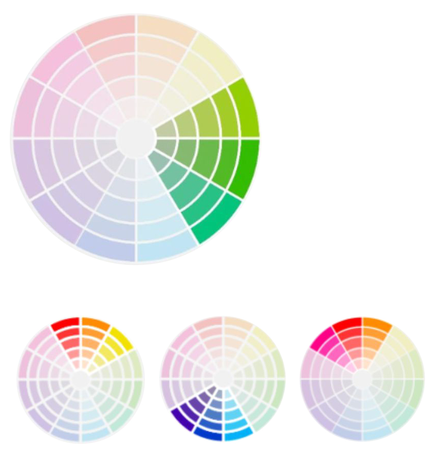
Similar colours:
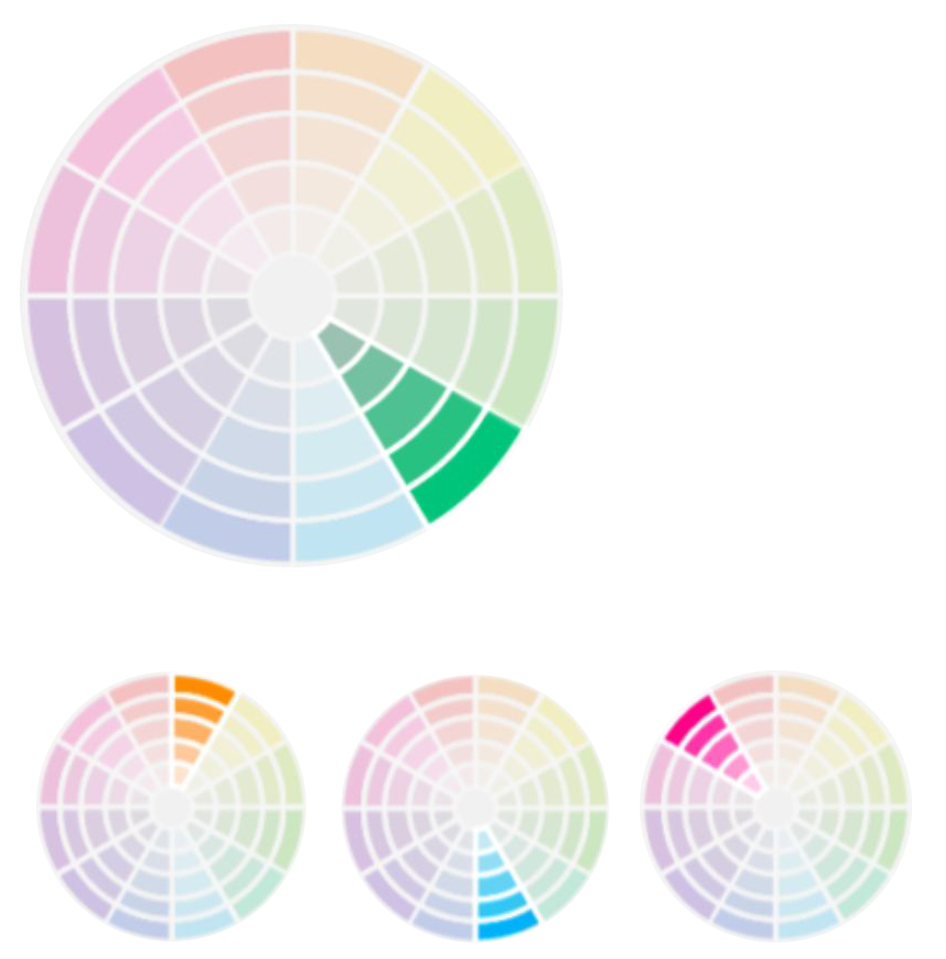
Starting from a color, all the colors immediately adjacent to it are chosen, clockwise and counterclockwise, on the color wheel.
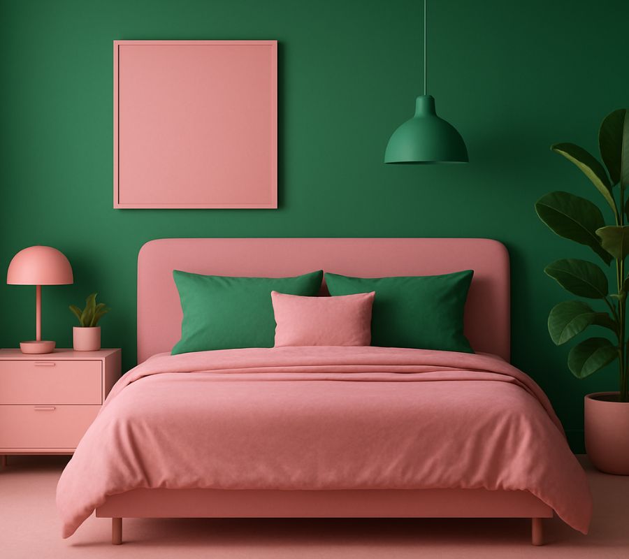
Complementary colors:
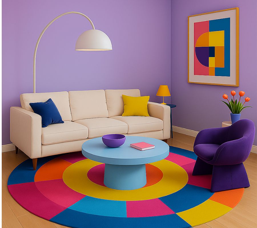
These colors are positioned at opposite ends of the color wheel. It's a difficult combination, but if managed well, it can yield striking results.
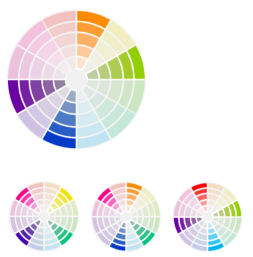
Complementary split:
Similar to complementaries, it differs in taking the surrounding colors to the exact opposite.
Monochromatic:
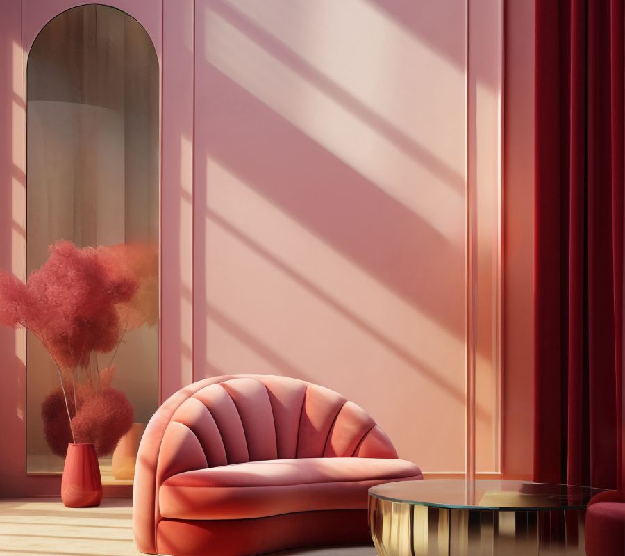
Starting from a color, the different shades of the same are selected.
Would you like more information? Feel free to contact us.
CONTACT US